ELEVATING ASAHI
SUPER DRY TO
AN IDENTITY STATEMENT
SUPER DRY TO
AN IDENTITY STATEMENT
Creative Direction
Art Direction
Art Direction

CHALLENGE
In the UK, Asahi Super Dry was the beer you ordered with sushi. It had no identity, and no reason for anyone to reach for it outside a Japanese restaurant. A food pairing, rather than a brand. The brief was to reposition it as a premium beer with a point of view.

PERSPECTIVE
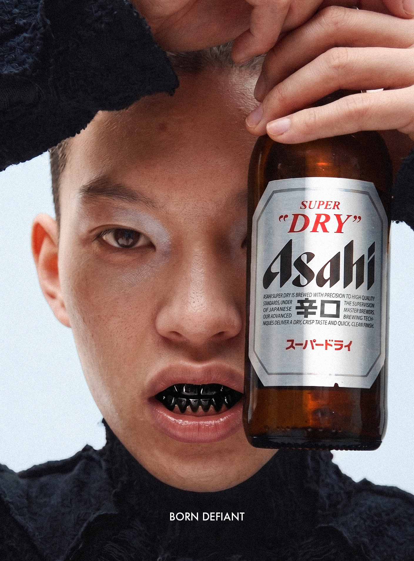
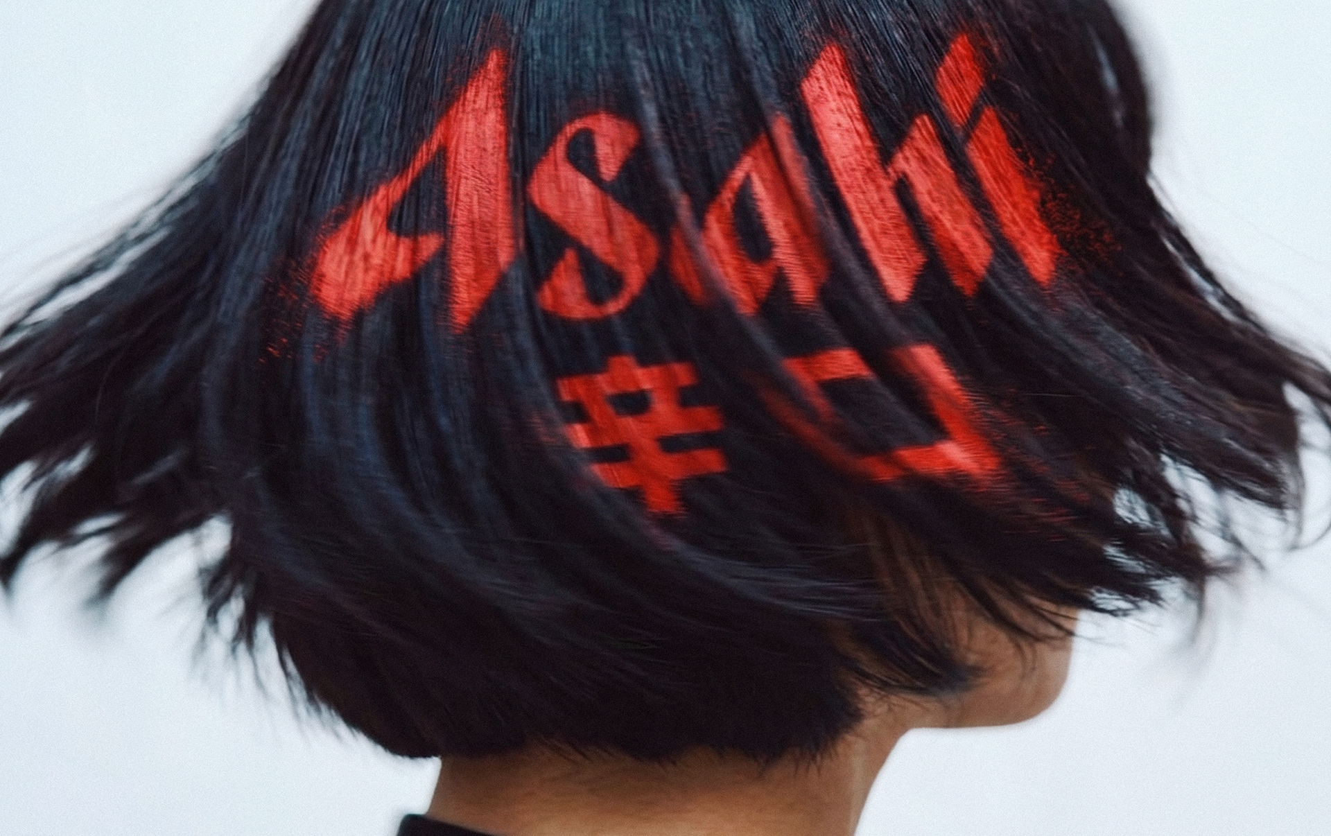
Asahi Super Dry was born from rebellion. The traditional lager method turned on its head, using rice in the grist to lighten the body and create something new. That spirit deserved a visual language to match. Not beer advertising. Not a pint glass on a bar. Something closer to what Japan actually feels like to the new, forward-thinking target audience in the UK.

SOLUTION
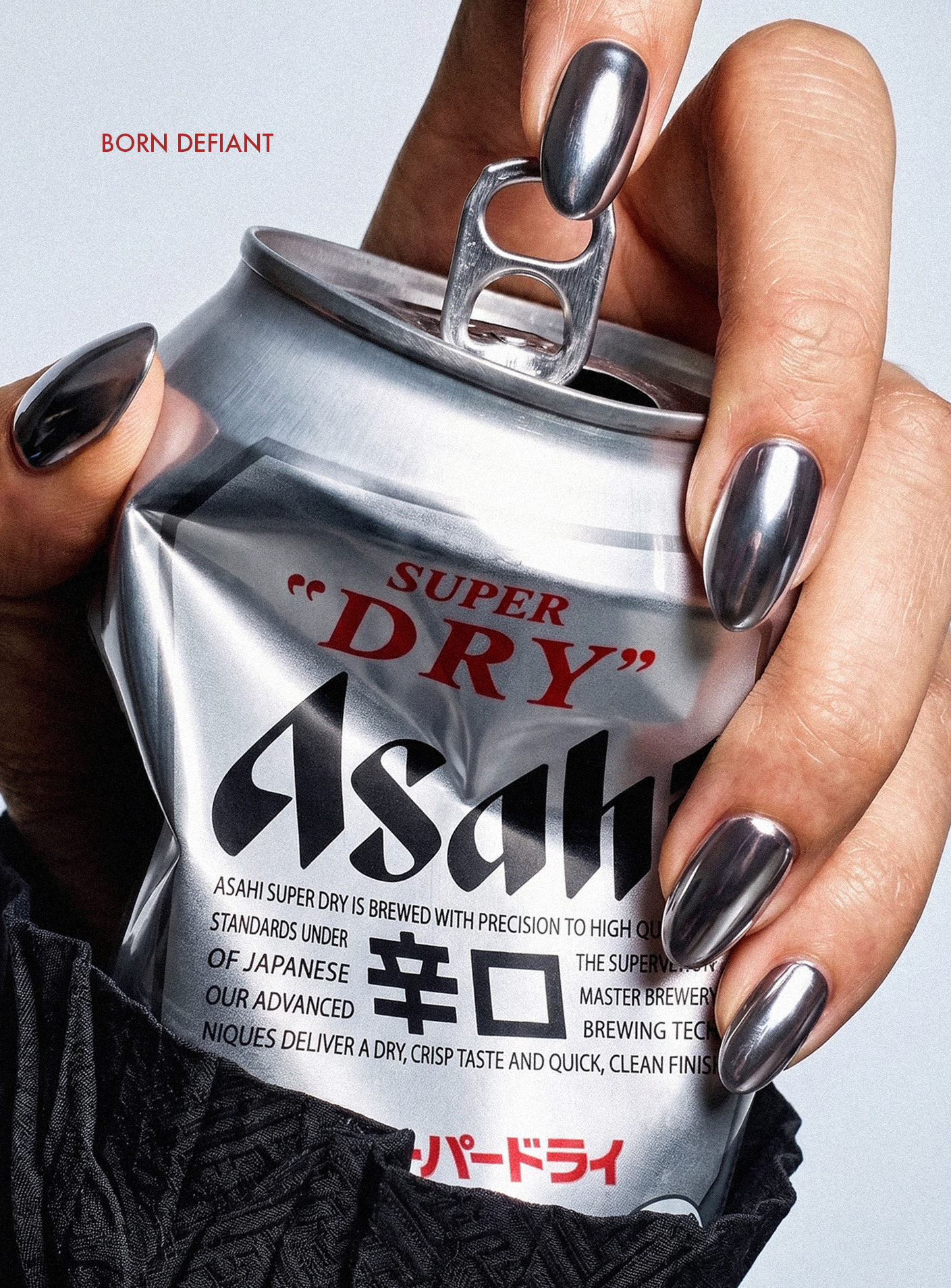
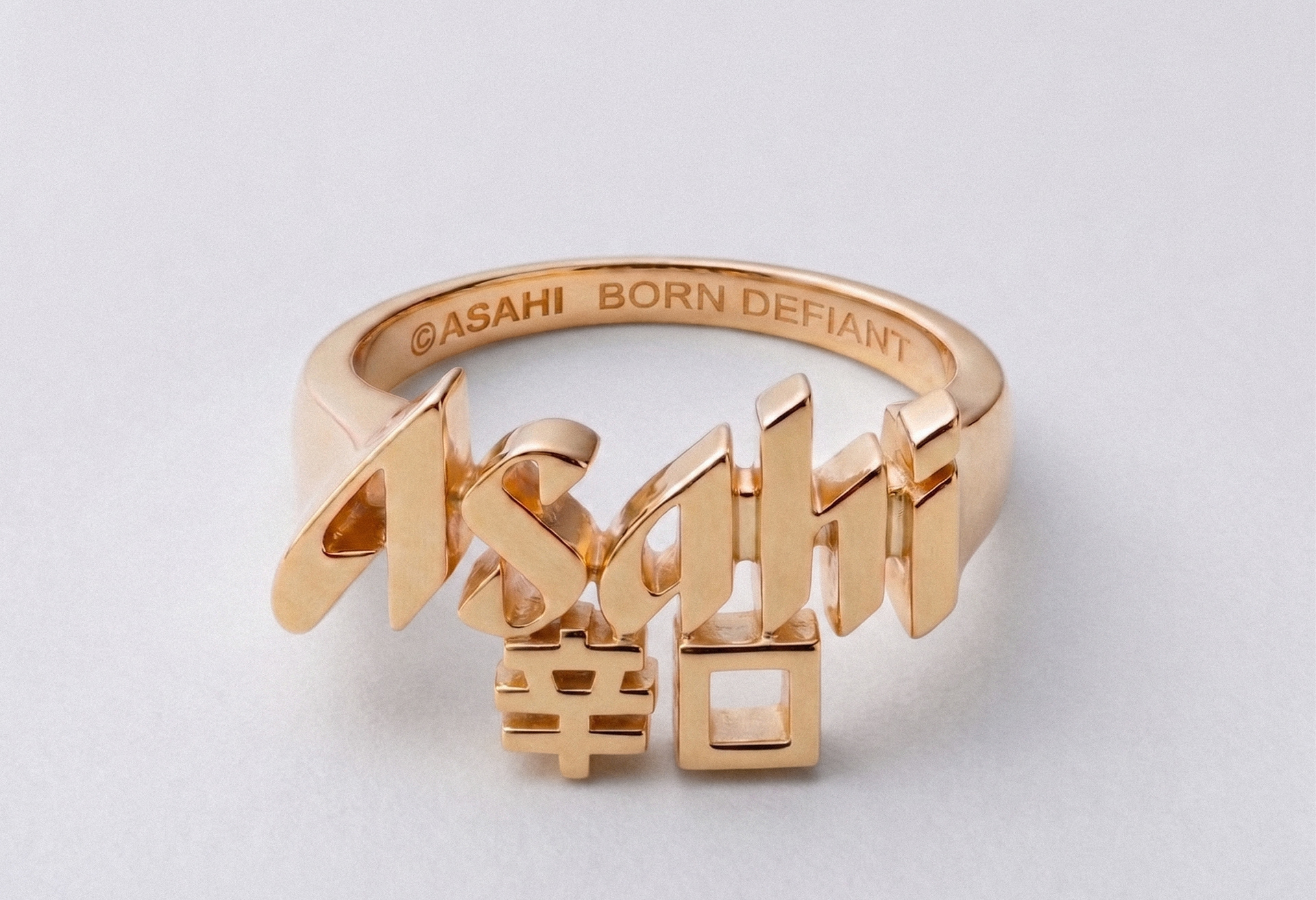
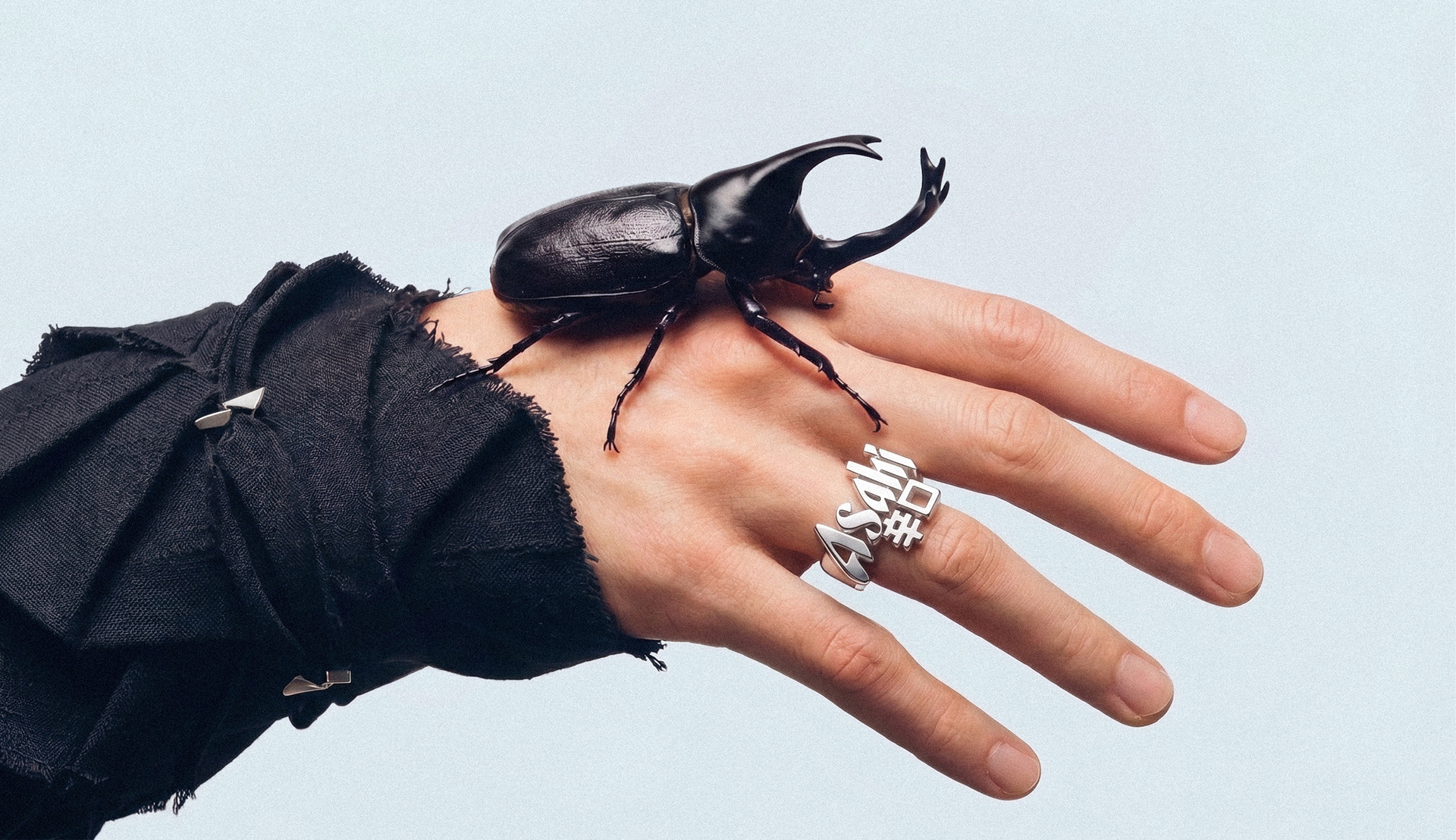
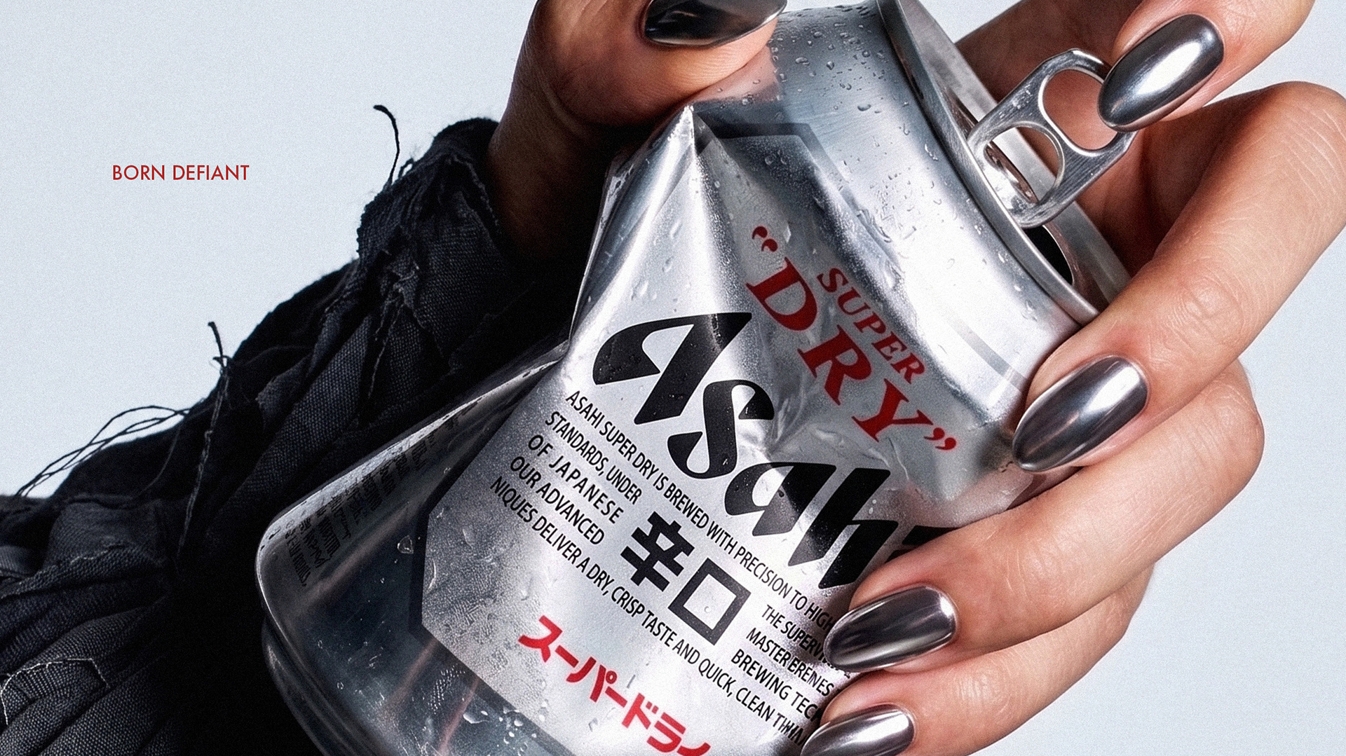
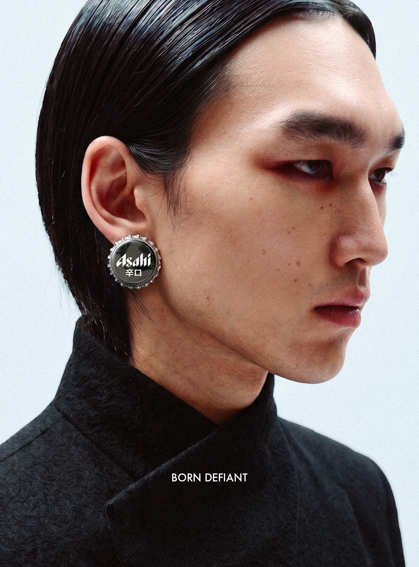
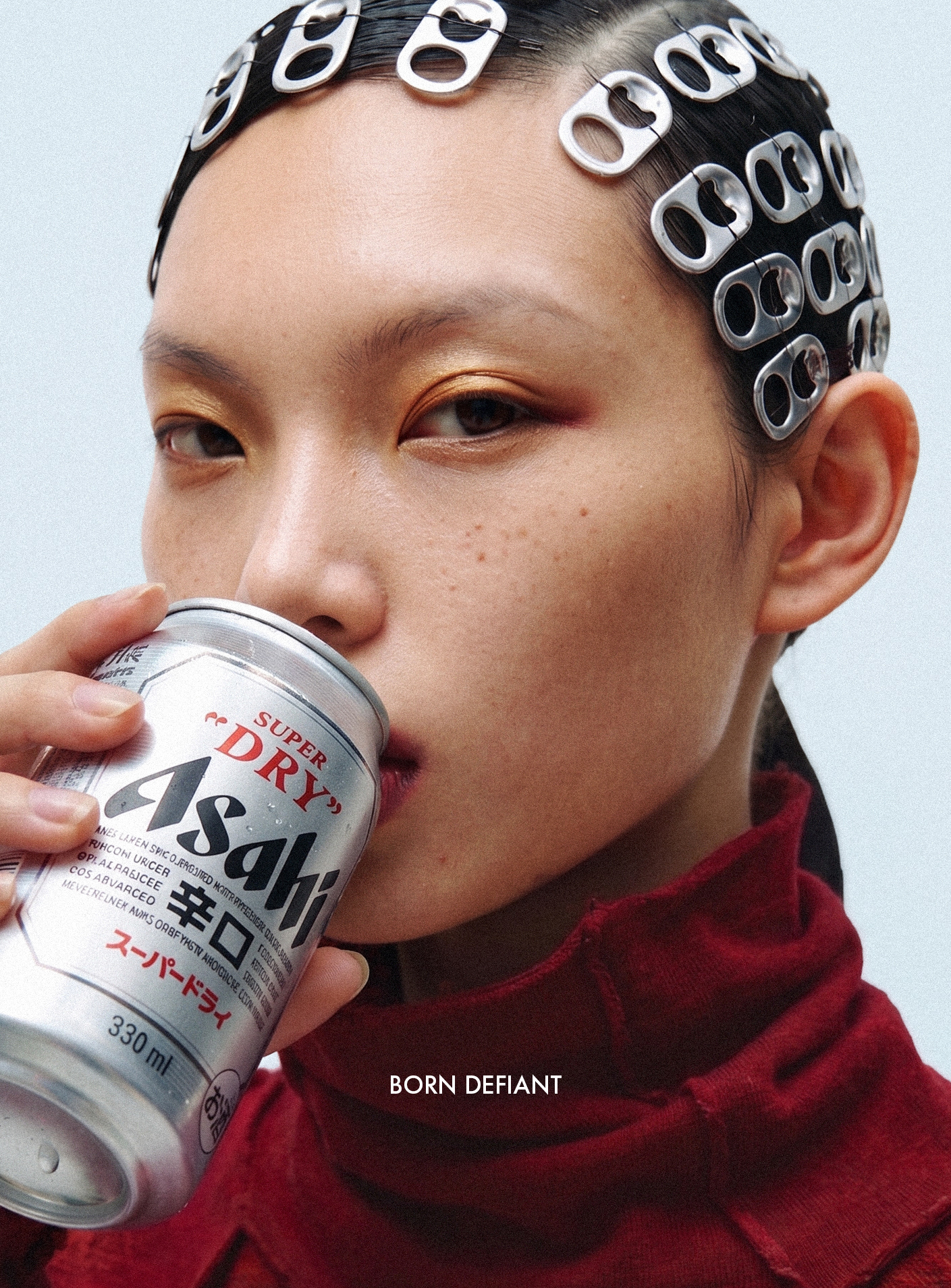
The repositioning was guided by the same spirit of rebellion. Borrowing from Japanese avant-garde culture, I treated the beer as an object to be seen with. The logo became a ring. The bottle cap an earring. The can something you hold, not something you pair. The art direction made Asahi Super Dry feel like it belonged in a fashion editorial: bold, composed, and completely indifferent to what beer advertising is supposed to look like.

IMPACT
The work started a complete process of repositioning for Asahi Super Dry globally. From a food companion to premium beer that represents Japan's creative confidence, and spirit of reinvention.